Enhances the `plotCounts()` output by providing greater resolution, displaying antigens per plate, and enabling SampleID name visibility via hover (transformed to Plotly in server.R)
Value
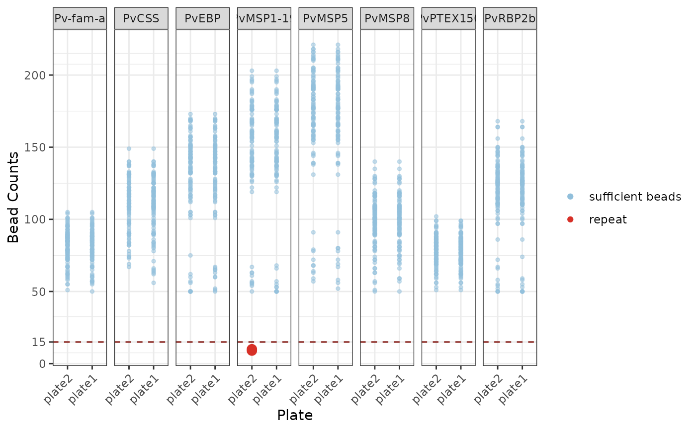
Dot plot with values > 15 threshold coloured in blue (sufficient beads) and less than or equal to 15 beads coloured in red (repeat) faceted by each antigen (ggplot).
Examples
# \donttest{

# Step 0: Load example raw data
your_raw_data <- c(
  system.file("extdata", "example_MAGPIX_plate1.csv", package = "SeroTrackR"),
  system.file("extdata", "example_MAGPIX_plate2.csv", package = "SeroTrackR")
)
your_plate_layout <- system.file(
  "extdata",
  "example_platelayout_1.xlsx",
  package = "SeroTrackR"
)

# Step 1: Read serology data and plate layout
sero_data  <- readSeroData(your_raw_data,"magpix")
#> PASS: File example_magpix_plate1.csv successfully validated.
#> PASS: File example_magpix_plate2.csv successfully validated.
plate_list <- readPlateLayout(your_plate_layout, sero_data)
#> Plate layouts correctly identified!

# Step 2: Process counts and perform quality control
qc_results  <- runQC(sero_data, plate_list)

# Step 3: Plot Bead Counts
plotBeadCounts(qc_results)

# }
# }